Specimen:
Tristyan / living style guide
Dark grey and bone white, with pops of colour. Shared colours, type and components for the project collection.
Charcoal and bone carry the page. Blue identifies a link, mint marks something ready to try, and orange marks work in progress. The same roles carry through light and dark appearances.
Bright pops belong in small marks, status dots and image details. Text uses a darker or lighter companion shade. The light-theme mint and orange text shades are tuned for readable contrast on bone.
These are opaque text/background pairs from the current theme. AA for normal text requires at least 4.5:1; decorative marks and rules have different jobs.
| Text / background | Ratio | Normal text |
|---|
The values below are read from the site’s CSS. Switch the appearance at the top of the page to inspect the other theme.
| Token / purpose | Current value | Copy |
|---|
Literata carries page and project headings. Fira Sans carries descriptions, small section labels, navigation and actions. Keep those two voices consistent; monospace is reserved for actual code in this guide.
Literata · --serif
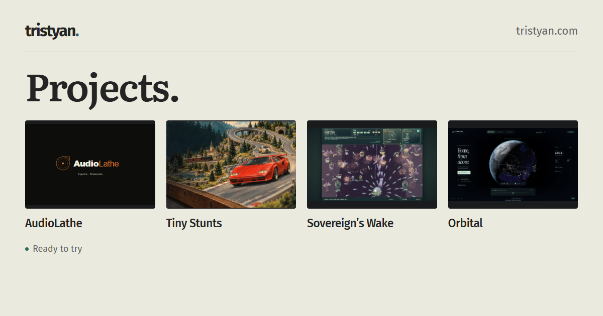
Projects.
Literata · --serif
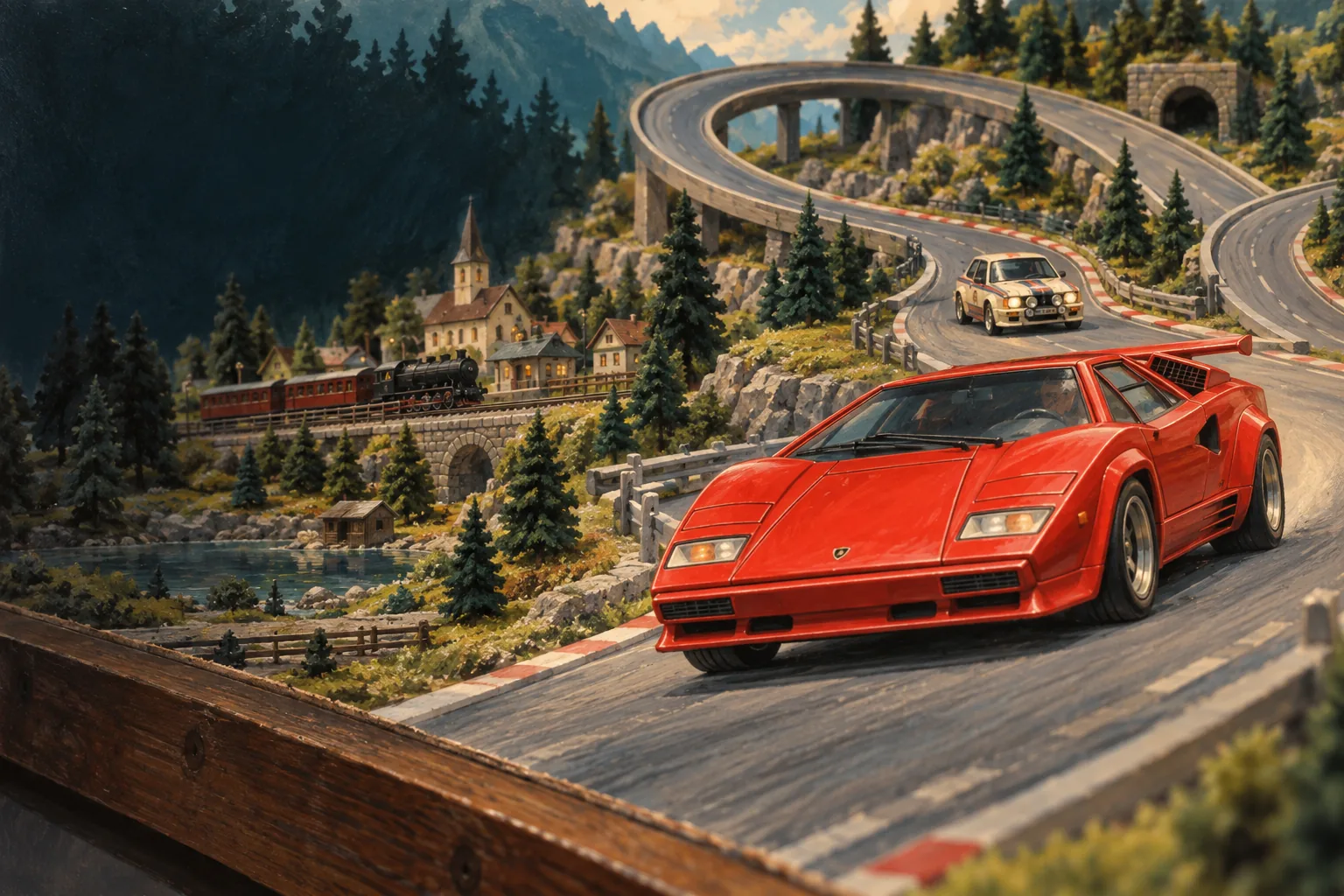
Tiny Stunts
Fira Sans · --body
Race miniature cars in your browser, upgrade your vehicles, and build custom stunt circuits.
Fira Sans · --body
02 / Miniature racing / Playable beta
Fira Sans · --body
Projects Guide Auto
Fira Sans · --body
tristyan.
Keep paragraphs comfortably narrow. Long titles wrap; descriptions remain complete. Use sentence case for reading text and reserve capitals for compact labels.
Every project uses the same action hierarchy. A solid button opens the project; quieter controls let someone watch or look around first.
Play opens Tiny Stunts in a new tab. Watch plays the existing film below. View gallery opens its full gallery in the local collection.
Words carry the status; colour is a supporting cue.
Available projects form one continuous collection. Each has the same title, description, action and media rhythm. Keep a compact directory above them, alongside the page title on wide screens. Group readiness with project metadata; keep launch and watch actions together. Work in progress uses the same language at a quieter scale.
On the working collection, all ready projects remain visible. Edge arrows change images in place. Expand opens the same image in the full gallery. Films start only when requested and pause when someone navigates to another section. Image frames use the source proportions; 16:9 is the fallback because it is the most common shape in this collection.
Use a small spacing scale. Keep related details close, leave more room between entries, and let a fine rule separate sections.
The collection is at most wide, with text beside media. Descriptions use a 38ch reading measure on desktop, 44ch on phones. The guide has a reading column. On phones, text and media stack.
corners and a single rule. Shape supports the content without adding another visual theme.
Interactive targets are at least high.
Motion acknowledges an action and then settles. Keep feedback quick, avoid continuous decoration, and honour the system’s reduced-motion preference.